Metal Building Color Guide: Choosing the Right Combination
The color of your metal building plays a major role in its overall appearance, curb appeal, and even energy efficiency. With 17+ standard colors available, the possibilities are nearly endless — but a little guidance can help you narrow down the perfect combination.
Understanding Your Color Options
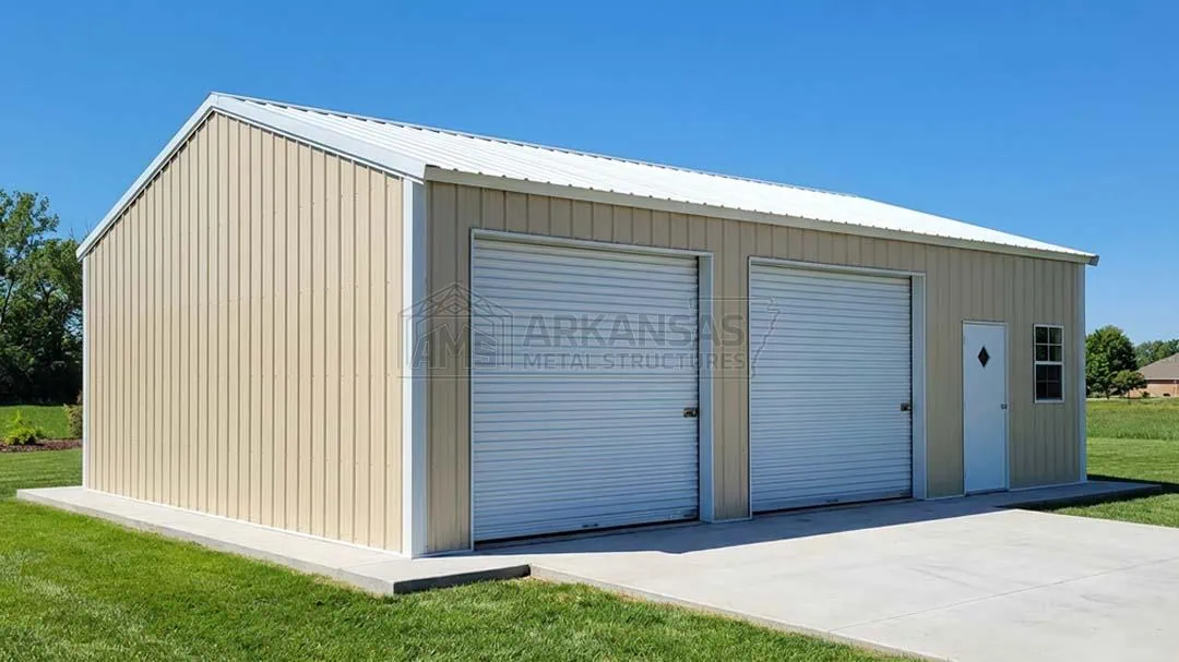
Most metal building manufacturers offer a palette that includes neutrals (white, clay, sandstone, pebble beige), earth tones (earth brown, rawhide, burnished slate), bold colors (barn red, bright red, burgundy, royal blue, evergreen), and metallic finishes (galvalume). These colors are applied as a baked-on finish that resists fading, chalking, and corrosion.
Popular Color Combinations
Classic Red Barn: Barn red walls with white roof and trim. Timeless and instantly recognizable, this combination works perfectly for agricultural buildings and rural properties.
Modern Professional: Pewter gray or quaker gray walls with white roof and charcoal trim. Clean, contemporary look that suits commercial buildings and upscale residential properties.
Earth Tone Natural: Earth brown walls with clay roof and white trim. Blends naturally with wooded or rural surroundings.
Bold Statement: Royal blue or evergreen walls with white roof and matching trim. Stands out while maintaining a professional appearance.
Tips for Choosing Colors
Match your home: If the building will be visible from your house, choose colors that complement your home's exterior palette.
Consider HOA requirements: Some homeowners associations restrict building colors. Check your HOA guidelines before ordering.
Think about heat: Lighter colors reflect more sunlight and keep interiors cooler, which matters in southern climates. White and light gray roofs can reduce cooling costs by up to 20%.
Check local regulations: Some municipalities have color restrictions for buildings in certain zones.
Color Samples
We provide free color samples so you can see how each option looks in your specific lighting conditions. Colors can appear different on screen versus in person, so we always recommend viewing physical samples before making your final selection.